Tuesday, November 19, 2013

Histogram


http://www.mathsisfun.com/data/histograms.html

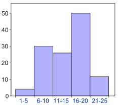
Histograms look similar to bar graphs, however they vary because each bar is connected in a histogram along the x-axis.  Histograms use the y-axis to display information by using different heights to show different data.  The histogram provided shows the number of girls and women who have bought a particular skirt from a clothing store.  The information shows that women in between the ages of 16-20 bought the most skirts.  By showing this information through bars that are connected, this graph can be considered a histogram.
Box Plot


http://www.physics.csbsju.edu/stats/box2.html


Box and whisker plots are useful because they display groups of numerical data through quartiles.  Each plot has lines that extend outside of the box, known as whiskers.  Point laying outside of whiskers are known as skews.  Whiskers display information by extending outside the lower and upper quartiles.  This plot contains "whiskers" that extend outside of the plot.  The plot is showing the dynamics of a box a whisker plot. By showing this, the plot can be considered an box plot.
Isopleth Map


http://dwb4.unl.edu/Chem/CHEM869V/CHEM869VLinks/weather.about.com/newsissues/weather/library/weekly/aa071600a.htm

Isopleth maps are useful because they are used to simplify data which is continuously distributed across a land area.  The map provided shows nitrate ion concentration throughout the United States during 1998.  The different amounts of data show variance through the use of colors.  Red represents the higher of concentrations with the highest concentration being in Michigan with a concentration of 2.0 mg/L.  By using the different points of data and color this map can be considered an isopleth map.
Index value plot


http://www.skepticalscience.com/What-causes-short-term-changes-in-ocean-heat.html

Index value plots are useful because they display not only a general trend of data but also the inconsistencies and discrepancies within the data.  The map provided shows the differences in El Nino and La Nina conditions over a twelve month period.  The different conditions are represented by two different colors and are displayed on either side of a x-axis.  By doing this can this map be considered an index value plot.
Doppler Radar 


http://www.noaanews.noaa.gov/stories2004/s2311.htm


Doppler radar maps are common weather maps that display day to day information on current weather conditions or predictions of what the weather will do.  Doppler radar is popular amongst meteorologists becasue it detects short-term weather conditions that are in motion.  They are popularly used for hurricane systems because they can detect high and low pressure systems.  The map provided shows a hurricane hitting the coast of florida. The radar uses different colors to represent the strength of the storm (such as amount of rain), with red being the most intense conditions.  By showing the motion of a hurricane hitting the east coast lets this map be considered a Doppler Radar map.
Climograph


http://ag.arizona.edu/watershedsteward//resources/module/Climate/az-climate_pg3.htm

A climograph uses a bar graph and a line graph to show information containing monthly precipitation and temperature conditions for a specific area.  These maps are useful because of their simplicity.  The map provided shows the monthly precipitation and temperatures for the state of Arizona.  By showing both of these weather conditions, this graph can be considered a climograph.  
Isotachs


http://www4.ncsu.edu/~nwsfo/storage/cases/20030123/small.eta_12z_300_000hr.gif


Isotachs are similar to isobars on connectivity, however they show a correlation in wind spinds particularly.  The map provided shows the different wind speeds through connection of lines throughout the map.  Colors are used to help show the different wind speeds.  By displaying wind speeds this map can be considered an isotachs.  
Parallel Coordinate Graph


https://onlinecourses.science.psu.edu/stat857/node/33


Parallel coordinate graphs contain a various amount of parallel axes.  Each value within the graph is plotted and then expanded throughout every axis represented as a line.  Each point plotted will connect through every axis.  The purpose of these maps is to display a multitude of geometric values.  In the map provided each person is represented as an axis and each line connects through each axis.  Since the lines connect through each axis this graph can be considered a parallel coordinate graph.
Star Plot


http://en.wikipedia.org/wiki/Radar_chart


Star plots give the ability to provide a multitude of different amounts of information.  Each "star" represents a specific piece of information.  These stars are aligned with each other so they can each be compared against one another.  The example provided shows 7 different aspects of MER IDD and Automated Designs provided by NASA.  Each star is given a specific color to distinguish it from the other stars.  By using different stars to represent data this map can be considered a star plot.    
LIDAR


http://www.noaanews.noaa.gov/stories/s798.htm

LIDAR maps use aerial views taken from planes that display a 3D image of a specific land area.  The map provided is from NOAA that shows buildings in New York in 2001.  This map is used to give construction workers a good idea of which type of cranes to use for the various buildings.  By using the 3D component in this map gives this map the credibility of being able to be considered a LIDAR map.
Isohyets 


http://www.hko.gov.hk/wxinfo/pastwx/mws201206.htm

Isohyets are maps that show lines of equal value.  Although these maps can relate to isotachs and isobars, isohyets give information on rainfall in a given period.  In the map provided there are lines which are connected according to equal value for rain fall.  The map shows distinct barriers where lines don't meet and colors change.  As the map changes so does the amount of rainfall.  The dark red and yellows represent higher rainfall than the blues and greens.
Stem and Leaf Plot


http://www.mytestbook.com/worksheet.aspx?topics=Stem%20Leaf%20Chart&subject=Math&grade=5&test_id=235


Stem and leaf plots are similar to that of a histogram in that they are a device for representing quantitative data in a graphical format.  They do this through a visualization of two different categories (Stem and leaf).  The example above shows both the stem which represents the first part of a number and the leaf which represents the second part of the number.  This stem and leaf plot specifically shows the distribution of quiz scores when the stem number and leaf number are combined in order.  By having both a stem category and leaf category we can consider this example a stem and leaf plot.
Triangular Plot


http://www.ex-parrot.com/~chris/wwwitter/20050407-it_doesnt_matter_how_you_vote_either_way_your_planet_is_doomed.html

Triangular plots give the ability to show three different sets of data in on graph.  The graph provided shows three different political parties through the use of different colors.  The different parties consist of the Liberal Democrat vote, Conservative vote, and labour vote.  Each expanse of color shows the probability of each party percentage to win an election in parliament in the UK.  By displaying the three different parties this graph can be considered a triangular plot.
Windrose


http://en.wikipedia.org/wiki/File:Wind_rose_plot.jpg


A windrose is used a lot by meteorologists.  The reason for this is because these maps display recorded wind speeds and wind direction for a location.  More modern windroses are able to show the frequency over a 30 year period of winds blowing from certain directions.  The example provided is up a windrose that is displaying wind information on the LaGuardia airport which is located in New York.  The longer bands display information of stronger wind speeds.  These speeds are also correlated with different colors.  By displaying this information this map can be considered a windrose.
Population Profile 


http://www.census.gov/2010census/

Population profile maps are charts that display information on the number of people correlated with their ages.  Just like the map provided, many of the population profile maps can be divided into male and female categories.  This specific map contains information from the 2010 census which gives information on total population on in the District of Columbia which is also divided by male and female categories.  By showing these different age differences through a span of 10 years, this map could be considered population profile.  
Scatterplot Graph


http://www.gardenersown.co.uk/education/lectures/r/graphs2.htm

A scatterplot graph displays two sets of information by using an X axis and a Y axis.  Each point displayed is a combination of the X axis and Y axis brought together. Once all points have been plotted a line (best fit line) showing the average slope amongst all of the points can be displayed.  The scatterplot provided relates distance vs. speed.  The graph shows the both of these variables are correlated with each other.  When one increases so does the other.  By showing the different points and best fit line within this graph, this graph could be considered a scatterplot.    
Lorenz Curve


http://en.wikipedia.org/wiki/Lorenz_curve

Lorenz Curve maps display the probable distribution of values which have been brought about statistically.  The map provided shows both the "perfect" equality of wealth distribution as well as the lorenz curve which shows the reality of wealth distribution.  By showing this curve of incomes for lowest to highest, this map can be considered a Lorenz Curve.
Nominal Area Choropleth Map


http://www.veiled-chameleon.com/weblog/archives/2004_07.html

A nominal area choropleth map is a specific choropleth map that represenrs nominal data in a simple way so it is easy to read the map.  The map provided shows which states during the 2004 Presidential Election were swing states and which states were either republican or democrat. The information is displayed through 3 different colors making it easy to understand.  By making these easy distinctions through color, this map could be considered a nominal area choropleth map.
Bilateral Graph


http://www.theatlantic.com/international/archive/2010/10/china-and-international-rules-self-interested-or-malign/64747/

Bilateral graphs display a variety of variables of information and the information is presented on either side of an axis on a graph.  The provided graph uses 3 different types of variables amongst increasing imports and also trade deficits in clean energy products in China during a span of 4 years (2006-2010).  There are three different colors on the graph which each display a different variable of information.  Green represents imports from Chins, blue represents exports, and red displays deficits.  By showing three different amounts of information on either side of an axis makes this example a bilateral graph.  
Standardized Choropleth Map


http://www.statcan.gc.ca/pub/92f0138m/2008003/figures/5200001-eng.htm


A standardized choropleth map uses information that is averaged or in other words standardized.  This category of choropleth maps are aerially averaged by land area.  The provided map shows the standardized data of the population of under 14 year olds within Canada.  Colors are used to show the variance within each section of canada.  By using the standardized information this map could be considered a standardized choropleth map.
Univariate Choropleth Map


http://www.colocarto.com/custom-thematic-maps.html

Univariate Choropleth maps a more simple type of choropleth map.  These maps display only one specific variable.  Although simple, the univariate choropleth map keeps up all of the standards to be considered a choropleth map.  The map provided uses only one variable which is the median household income for 2008.  The different shades portrayed show the different amounts of income.  By showing this one specific piece of information, this map could be considered an univariate choropleth map.
Unclassed Choropleth Map


http://www.mapresso.com/

An unclassed choropleth map displays both the same amount of categories within the map as well as the same number of data values.  These maps are aerial photos that are given a specific values to display.  The map provided shows a mass amount of different categories and each category has its own color which represents the data wanting to be displayed.  By showing all of these different categories and data values this map could be considered an unclassed choropleth map.
Bivariate Choropleth Map


http://www.cartogrammar.com/blog/indiemapper-is-here/

A bivariate choropleth map show two different data amounts at the same time.  The map provided shows age populations within the United States at the start of the twentieth century.  The key provided by the map gives two different sets of data (ages 5-17 and ages 50-64).  The different types of data are distinguishable by colors.  By using two different sets of data, this map can be considered a bivariate choropleth map.
Range Graded Proportional Circle Map

http://personal.frostburg.edu/mtmaier0/maps.htm

The range graded proportional circle map is unique because it displays only one single variable.  This variables ratios and proportions are related with circles of various locations.  Each circle within a map shows a specific point on a land area.  The circles vary in size due to the amount of information being displayed.  The map provided shows the amount of traffic fatalities within the United States.  Circle location displays each individual state and the size of the circle displays the amount of fatalities each state has encountered.  By using these circles to display this information gives this map creditability in being a range graded proportional circle map.
Classed Choropleth Map


https://www.e-education.psu.edu/natureofgeoinfo/book/export/html/1553

Classed choropleth maps use aerial units of land areas to group into various categories.  Each aerial unit (such as a state from the example provided) is divided into different classes and each class has a specific color given to it.  The map provided shows the different Hispanic densities throughout the United States through their use of color shading.  By displaying this information in this particular way, this map can be considered a Classed Choropleth Map.
DRG


http://www.tceq.texas.gov/gis/drg.html


Known as a Digital Raster Graphic, a DRG map is an image of a topographic map provided by the USGS that has been scanned through a computer.  These maps provide a multitude of information such as geographical features, spacial data, etc.  The map provided is a scanned topographic map that is showing the Colorado River within an urban area.  The different amounts of information such as highlighted streets make this map a DRG map.
Continuously Variable Proportional Circle Map


http://www.lib.utexas.edu/maps/europe/italy_ind_1972.jpg

http://www.lib.utexas.edu/maps/italy.html


The longwinded name of the continuously variable proportional circle map is a map subject of the proportional circle map.  However, this map displays a multitude of variables to show exactly how the different circles relate to each other through their proportions.  These maps are useful because they can display relating scales to data specifically through their use of circles.  In the map provided, the circles represent the different industries within Italian cities.  These circles, just like a proportional map, use size to display how large an industry is, however they also divide these circles within themselves to show the different industries within each city.  By displaying all this information through circles makes this map a continuously variable proportional circle map.
DLG


http://tahoe.usgs.gov/DLG.html

Known as a Digital Line Graph, a DLG is a cartographic map that is represented in digital vector.  These maps are distributed by the USGS.  These maps are useful because they provide a lot of different information amongst geographic features.  This picture provided represents the Lake Tahoe Basin, which has DLG data compated together in different quadrants to make the information easier to follow.  By doing this, we can consider this map a DLG.
DEM


http://pubs.usgs.gov/dds/dds-81/Intro/TopographicData/DEM/DEM.html

Known as a Digital Elevation Model, DEMs are maps that show a variety of information such as wind patterns or precipitation patterns, however the one main attribute to these maps is elevation differences.  The map provided shows the different elevations in the United States, with most of the elevation differences being shown in the different mountain chains of America.  By displaying these difference elevations, this map could be considered a DEM map.
DOQQ


http://www.lib.ncsu.edu/gis/doqq.html#cir

DOQQs use aerial images that are displayed by the USGS.  These maps use a resolution of 1 meter.  These maps use orthorectified aerial photography which is a computer generated image.  By doing this the terrain relief and camera tilts can be removed. This picture provided is a picture of a land area which shows no type of terrain relief or tilt, making it a DOQQ map.
Isopach Map


http://www.geology.ohio-state.edu/~vonfrese/gs100/lect35/index.html

Isopach maps are maps that use information to display differences in rock thickness in a variety of regions such as the map provided.  Contour lines are used in this method to show the equal rock thickness'.  This map specifically shows the different rock differences in the Cambrian System of North America, making it a credible isopach map.  
Infrared Aerial Photo


http://cae2k.com/photos-of-roma-0/infrared-aerial-photo.html

Infrared aerial photos use a specific portion of the light spectrum that the human eye can not see.  These photos are taken from aircrafts, spacecrafts, and other vehicles.  The picture provided shows a river and the vegetation surrounding the river.  The infrared gives the different environmental aspects a the picture a more vibrant color making it easier to study the area.  By using an infrared technique in the aerial photo this example can be considered an infrared aerial photo.
Isobar


http://www.sercc.com/education_files/saer_ans.html

An isobar is a map that uses different lines to connect points of equal pressure on a weather map.  These maps which are measured in millibars, use the mean sea level pressure as a standard control.  This map displays different temperatures throughout the country using isobars to connect the different pressures.  This gives the map credibility in being considered an isobar map.
Cartographic Animations Map


http://maps.unomaha.edu/AnimArt/ActiveLegend/Peterson.html

Cartographic animation maps use computers or videos to display information in a new technological way.  By doing this, maps can display differences in dimension in a simple way.  This map uses a variety of different health related deaths to represent the different ways and amounts of deaths among people within Nebraska.  The different links on the side of Nebraska make this a new technological advance for maps.  This quick easy method of finding diseases is what makes this map a cartographic animations map.
Statistical Map


http://seattlebubble.com/blog/2006/09/11/mapping-housing-market-health/


Statistical maps are maps that use statistics from numerical information or data to display information over a land area.  This map shows the income drops of people throughout the United States by displaying numerical values for each state.  By doing this, the provided map can be considered a statistical map.
Black and white aerial photo


http://www.math.toronto.edu/drorbn/Gallery/KnottedObjects/Interchange/index.html

Black and white aerial photos are basically what their name displays.  They are photos taken from an aerial view (usually a plane, satellite etc.) and only display black, white, and grey colors.  By using this method in the picture provided, different roads, vegetation, and buildings can be easily viewed.  By using this method of displaying a picture makes this a credible black and white aerial photo map.  
Flow Map


http://www.lib.utexas.edu/maps/texas/combtrk_tx_1998.jpg
http://www.lib.utexas.edu/maps/texas.html

Flow maps display the movements of objects that travel from one location to another.  These maps use a mix of flow chats combined with maps to display a variety of tangible item to intangible items.  The map provided shows the outflow of trucks coming out of Texas by using red lines to show the route taken.  By using these different features this makes this map a credible flow map.  
Dot Distribution Map


http://hosting.soonet.ca/eliris/remotesensing/bl130lec7.html


A dot map displays different quantitave data found in particular areas. The map provided uses dots to represent 100,000 people each dot.  By using these dots, different populations can be seen throughout the United States.
Isoline Maps


http://www.middleschoolscience.com/isotherms.htm

Isoline maps use connecting lines and points that are equal value to portray distributions of numerical values continuously.  These maps are often used for weather conditions such as different temperatures, wind speed, barometric pressure, and direction and sheer.  This map displays different temperatures throughout the United States and Canada.  Areas with the same temperatures are connected with different lines making this map a credible isoline map.  The different colors are used to represent differences in temperature such as red being hotter than green areas which are cooler.    
Hypsometric Map


http://www.cec.org/Page.asp?PageID=924&ContentID=2841&SiteNodeID=497&BL_ExpandID

A hypsometric map uses heights of different land surfaces and contour lines to depict land configurations.  This map uses 3D configuration to display North American height compared to that of the standard sea level.  This map also uses color to display the different heights.  By using the differences in height elevation and contour lines this map can be considered a hypsometric map.  
Propaganda Map


http://kuoest.wordpress.com/

Propaganda maps are used to persuade people into believing different views by using a distortion of scale boundaries.  This map is a representation of how Ronald Reagan viewed the world during the cold war.  The USSR is shown as very big and red and is given a more intense or scary image than america.  This propaganda map can be considered a map because it uses different scales and distortion to persuade people to view the world in a specific geopolitical view.  
Proportions circle maps


http://personal.frostburg.edu/sbriggs0/maps.htm

Proportional circle maps use circles of different sizes to display certain information.  This map shows Walmart densities for the different states in 2009.   In this map the larger the population of Walmarts per state, the larger the circle.  This map can be considered a map because it uses the united states to display specific information.
Cadastral Map


http://www.actgeospatial.com/services.php


A cadastral map is a map which that displays land ownership areas.  The map provided is a good example of a cadastral map because it highlights the different property boundaries for a neighborhood.  This map is useful because not each property is physically divided with barriers (such and a fence).The map gives a good distinction of where each neighbors property line ends.  this map can be considered a map because of its use of boundary lines separating the different properties.  
PLSS Map


http://www.fgdc.gov/library/whitepapers-reports/annual%20reports/2008/web-version/AppendixC.html

Known as the Public Land Survey System, a PLSS map is used as a cadastral map which is designed to assist in identifying land ownership between different areas.  This map is an example of a standardized PLSS map that is statewide.  This maps information shows 30 public domain states.  By using a PLSS map people can find different land ownership information in different regions, making it a very useful map. 
Choropleth Map


http://my.ilstu.edu/~jrcarter/Geo204/Choro/Tom/


Chroropleth maps are maps that uses colors, whether it is different colors or different shades of the same color to display information about different areas. The above map is an example of a choropleth map that shows the different densities of hispanic people per county in percentages.  The darker the green the more densely populated that area is.  Choropleth  maps can be considered maps because they use different land areas and information to display through colors.  

Monday, November 18, 2013

Thematic Map


http://www.icsm.gov.au/mapping/maps_thematic.html


Thematic maps give the ability to decipher different kinds of information and detail.  These maps highlights or depicts a specific topic or theme.  These maps are common in representing population densities, weather conditions, and geologic maps.  Represented in this map is the continent of Australia with its surrounding Maritime Boundaries.  It uses colors and lines to show the deferent maritime zones.  

Topographic Map


http://en.wikipedia.org/wiki/Topographic_map


Topographic maps give an extensive close up to detail about a certain place, such as the example map.  These maps use contour lines on a detailed large scale modern map.  This map uses intervals that are made at 100 meters and the color code is based on the elevations and heights of the specific area.  By showing contour lines and different amounts of elevations gives this map type creditability.


Azimuthal Equidistant 


http://www.acsu.buffalo.edu/~dbertuca/maps/cat/map-projections.html

This map is an example of a spherical surface that is placed on a flat plane, in other words it is an azimuthal map which is also equidistant. These maps use a flat plane that is tangent to a spherical surface.  This gives way for contact at a single point.  This flat plane containing a spherical surface creates an azimuthal projection.  This map contains points that are in a true distance as if it were in reality, having each point maintain its actual proportions in retrospect to other points.  This makes th map equidistant.


Planimetric Map


http://www.emapstore.com/maps/tmfl3072.html


 Planimetric maps are maps without any type of relief features. These maps have no indication of vertical position because they do not include elevation, only horizontal positions. Western Florida is being represented in this map. It only shows the horizontal highways and roads, however there is no representation of elevation or relief features.

Friday, September 13, 2013

Mental Map


Mental Map

A mental map is a map that is created through the image of ones own memory and imagination. It's a map that can be easily created with a piece of paper and a pencil. Since these maps are created through one's own mind, no map will be the same as another. People tend to express different landmarks than others, giving each map a unique feel to it. The sky's the limit when creating a mental map, it all depends on its creator. As you can see from the picture above, the creator emphasized big roads rather than other qualities in the map.